There's a secret trick in game dev: whenever you have enough signs & feedback, you should add more.
If we think about it, playing a video game is nothing more than interacting with software whose programmed rules decide what to display on the screen. Our brain conveniently provides the necessary abstraction layer to make sense of those pixels. That's why we need signs to discover the actions available to us and feedback to understand their consequences.
In the past few months, while researching for my first game, I've playtested many demos of indie strategy & card games. Unfortunately, the same problem kept coming back: poorly designed signs & feedback. They are there but often too subtle; as a result, the experience feels dry and difficult to grasp. And it's a shame because signs & feedbacks are the foundations that can make or break the experience.
So, in order to get better at them, I took a look a Hearthstone, the king of digital card games, and discovered it all comes down to two design pillars: sequencing and dramatization.
Layers of feedbacks
Hearthstone is a card game, so the temptation is to look mostly at the interfaces, but one should always remember that signs & feedbacks also include animations, sound effects, AI, FX, voice & more. Making a game clear & responsive is everyone's job in the team: most signs & feedbacks have several layers, and the number one mistake is picking only one.
For one, you never know exactly in which context the indication will be perceived: is the screen small or big? Are people watching or controlling? When was the last time they played, and how much do they remember?
Even in a turn-based game with no time limit, a lot of information can fly over a person's head, you don't want to put all your eggs in the same basket. And you'd also rather have huge Easter-painted eggs than small discreet ones.
Look how bold & explicit Hearthstone can be when it comes to mulligan (the selection of starting cards): there are large green glows around cards you can click and a huge red cross & a “REPLACED” label on the one you'd like to change. The top of the screen reminds you of the actions you can take here, the button at the bottom spells out “Confirm”, and to top it all, the rest of the screen is darkened to ensure your focus stays there. You can't make it more straightforward.
That being said, signs are relatively safe in 2D games with no time pressure: you have tools to direct the player's focus & they have time to process it. On the flip side, feedbacks have to be even better to surface the game's internal rules: the player has to understand the chain of consequences of their decisions to make informed choices. Hearthstone handles those dramatically and with particular attention to sequence.
Designing outstanding feedback in three steps
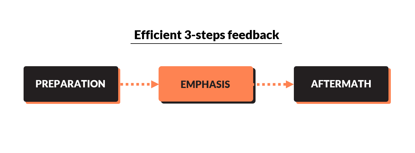
The key objective of feedback is to inform the player of the consequence of an action and how it changes the state of the game. Most feedbacks in Hearthstone seem to follow a similar structure in three phases:
Preparation: where you build anticipation & let the player know that something is about to happen, giving them time to pay attention
Emphasis: where the actual action is performed, and the animation reaches its peak (this is where Hearthstone doesn't shy away from going 300%)
Aftermath: to give enough buffer to let the player process the information and ensure that several actions won't chain abruptly
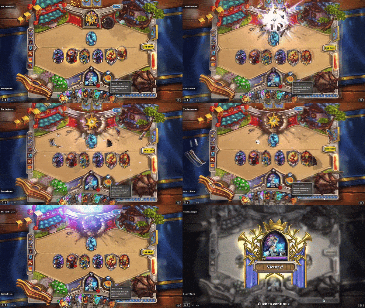
Each of these steps is critical to maximizing the readability & the impact of the feedback. Let's take a first simple example with the victory animation below:
after the last hit, there is a brief static moment when damage numbers are still displayed (preparation)
then comes the explosion, with pieces of the enemy's portrait flying towards the shaking camera, a loud sound and even fireworks! (emphasis)
finally, you can notice another short pause once the camera stabilizes before the “Victory” pop-up apparition (aftermath)
Here is another example with one long feedback sequence to inform the player that they reached their turn time limit:
The rope is deployed & the hero says a voice line (preparation)
Then plays the sparkling fuse animation, in the middle of the screen (difficult to put more emphasis than this)
And finally, the “end turn” button explodes (aftermath)
I have a hard time imagining better feedback than this one: it's explicit, it's intuitive, and even if one might think that using a ticking bomb analogy is over-dramatic (it is), it's certainly far more memorable than a boring microwave countdown popping in the corner of the screen. The designers here knew precisely how to catch the attention & to convey critical information visually with the proper emphasis.
Playing with the rules
Once you get the basic principle of sequencing, you may start tweaking each phase to give a different feeling. Indeed, feedbacks cover a lot of contexts, some are positive, some are negative, with more or less importance.
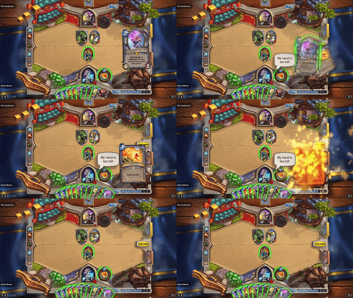
Let's take, for instance, the card draw: in Hearthstone, you have a limit of ten cards in hand, and if you get extra, they are discarded. This potentially frustrating mechanic has to be adequately feedbacked to avoid confusion, especially since it's an exception to the standard rule.
Preparation: the animation of the card coming from the deck (builds anticipation)
Emphasis: the card is shown in full size (as usual), but then it explodes, and the hero says a voice line (always accompanied by the speech bubble)
Aftermath: almost absent here, giving a feeling of abruptness compared to the “expected” aftermath (the card joining your hand)
Missing a card draw is far from ideal in a card game, and this animation adds salt to the injury, leaving you with a sour taste in your mouth while being perfectly explicit about the rule applied.
Once your deck is empty, the rule is that you take increasing “fatigue” damage for each draw: again, they chose similar preparation feedback to remind you it's a consequence of the card drawing phase, and then the animation places the bigger fatigue card in the centre and making it goes in black fume.
For the added dramatic effect, the hole that used to keep your deck is now a lava pit, which you can hover with your mouse to learn more about the rule. Indeed, the text on the “Fatigue” card is difficult to read in the time it appears, but sometimes, it's preferable to keep the timing short and rely on the player's curiosity to dig deeper. In most cases, once the player knows the rule, they won't ever need to read that text again anyway.
One Last Thing
When working on such a topic, there's a risk as the developer who sees them all day long finds them too long & the game less responsive.
In the two gifs above, notice how the player regains control (green outlines) while the animation finishes: this is the key to ensuring the player never feels locked in an animation they might have seen a hundred times. Of course, developing such a system that decorrelates animation from interaction takes more time, but it's worth it.
A developer is never the best person to assess the quality & relevance of their own signs & feedback anyway; they know the game too well for that. So remember always to add more.
If you liked this piece about signs & feedbacks, you may also like:


