On Minecraft Ugliness
How ugly blocks & low-res textures helped Minecraft take off
When did you first discover Minecraft, and what did you think the gameplay would be judging by the visuals?
It was in 2010 for me. I got increasingly intrigued by the people who kept bringing up this new game « Minecraft » on Twitter. So I typed it in Google and landed on the developer website. I then remember being mesmerised by the screenshots there, the ugly blockiness of this game was so fascinating. I purchased it immediately.
Now, when did you discover that Fortnite would also let you destroy & build anything? It took me a while.
Ugliness is a strength
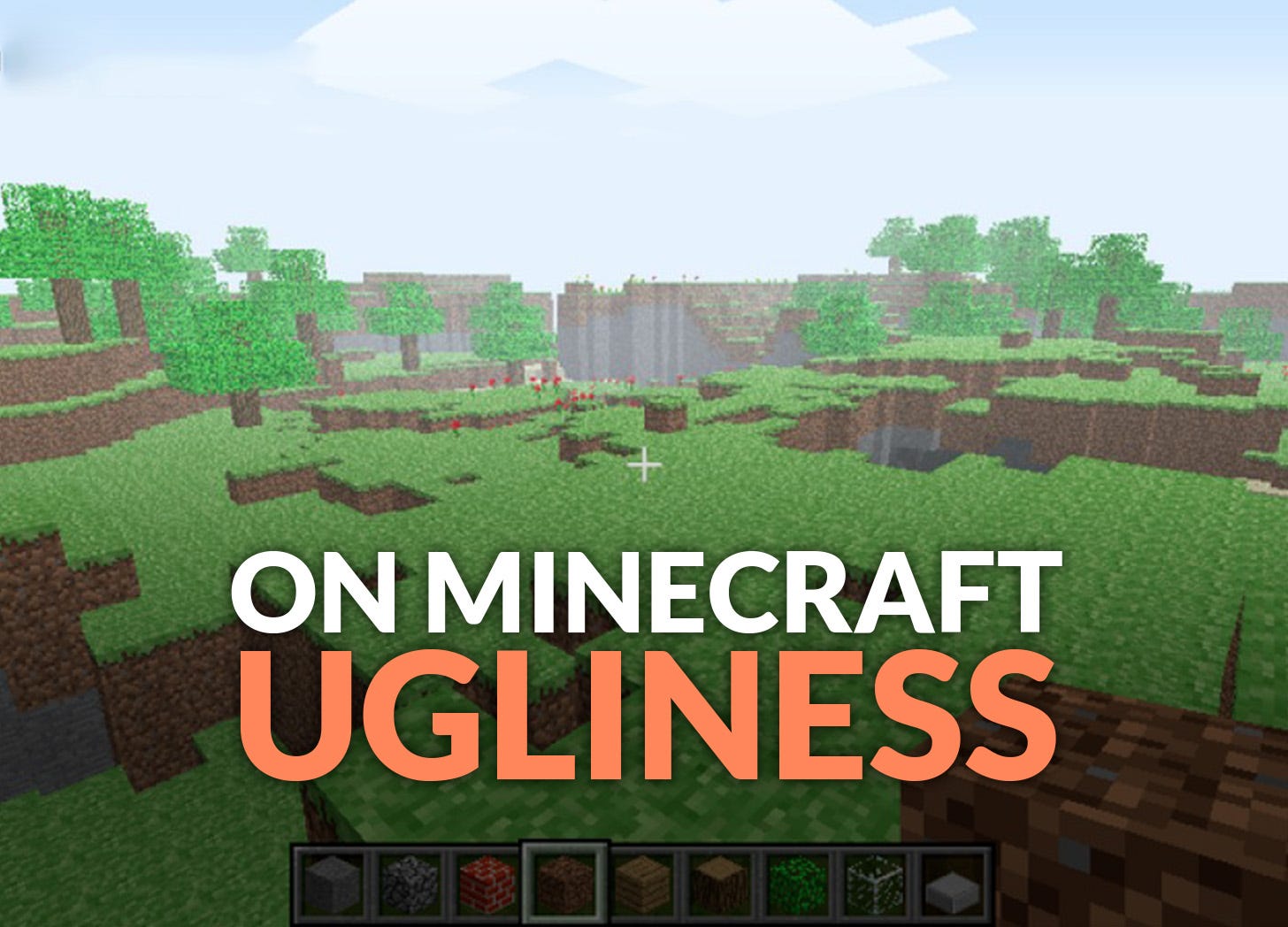
When Minecraft exploded in popularity, there wasn’t any first-person game with such low-quality graphics. Some players liked this style (or most likely, got used to it), but the consensus was that visuals were the game’s biggest weakness.
In hindsight, we may consider that the squared blocks and pixelated textures slowed its progress towards mainstream acceptance and that a team with more resources could have made the game more pleasing to the eyes. I believe, on the contrary, that this peculiar look only served to reinforce its popularity.
First, we’ve got to remember the context: at the time, you could only purchase the game from the official website, and there was no advertisement; you had to hear about it from social media or word of mouth. It made Minecraft feel like a hidden gem only a few could lay their hands on (although we were millions already). Its terrible graphics in that regards acted as a rite of passage: Minecraft was a game accessible only to those who could see the beauty of its gameplay behind the ugly blocks.
Why Minecraft captivates instantly and Fortnite doesn’t
Then, of course, Minecraft’s visuals aren’t ugly for the sake of it: they serve the gameplay. In a world made of cubes, having clear separations between the blocks helps for the readability of what you can break and where you can place. The cubes are the concept. And when you looked at a Minecraft screenshot for the first time, you could only see the cubes.
Tech-wise, it’s not rocket science to add more shapes to the procedural generation, if not rounded shapes, at least slopes. Lego did it before. But it’s not the goal here, as it would water down the premise and make the elements less distinguishable. Increasing the graphics fidelity through beautiful shaders makes the environment harder to read.
I mentioned Fortnite in the intro, it’s an interesting case for me. The cartoony art direction has a higher level of detail and because of that, the promotional screenshots don’t make it that clear that building is a key part of the experience. I discovered quite late that you could break everything in Fortnite, whereas observing a single Minecraft screenshot made it obvious.
I’m not saying that Epic Games are bad at selling their game, in fact, the promotional materials are a good at showcasing the original blend of coop-shooter, zombies & constructions. Unfortunately, it’s just not as instantaneous as Minecraft.
Three tips to hook with a single image
What this teaches us is the importance of selecting an art direction that best signals the experience you aim to deliver, not just the better-looking. Ideally, a single screenshot could inform a player of the game mechanics, the challenges he’ll face, the emotions he can expect, and what sets your game apart.
On a screenshot, here are three key elements to be mindful of:
The UI (or its absence): with just a few elements, you can frame your game within a genre and hint at your specificities
The camera’s position and angle: looking down from the top of a tower doesn’t tell the same story as seeing a giant robot dinosaur from below.
The level of details: Valorant’s near-empty maps remind you more of a competitive sport than an immersive narrative-rich shooter
Your priority is to be clear about the concept; you don’t want players to be misled, and your second is to hook the player. There are many ways to do so: one of them is to contradict the expectations like Minecraft does by associating first-person camera (AAA blockbuster code) & pixelated look (indie 2D platformer).
If we push this logic to its paroxysm, we could design games with intentional “bad” graphics, as long as it helps the game stand out. The amazing A Short Hike has this very low resolution rendering that makes it unique. There is also a whole “Simulator” genre, where buggy physic-based animations help signal the type of brainless fun they offer. Or minimalistic puzzles which scream “you’re here for the challenge, not to explore the scenery”.
Unconventional visuals can be an asset to sell your game, and when they’re easier to produce, just go for it and hit two birds with a stone!
If you liked the topic of this article, I think you could also enjoy this one:


I wouldn't even say Minecraft's visuals are ugly. I'd say the visuals are simple. And that simplicity is what makes the game so readable.
I always thought that the reason Minecraft became so popular among all ages is its readability, it's extremely clear what the units of world are, what their relation is, it's all about cube, you immediately see how you can break and build and do whatever you want. Game that offer similar experiences without the blocky aspect just don't hit the same spot.
Plus it's embracing this look and made it quite an original art direction to stand out as well