Stacklands and the UX of Cards
Cards are everywhere in board games already, but new ideas still emerge from video games
Among our 274 board games collection, 236 have cards.
Whether they’re actions to perform, unpredictable events decks, characters, items, abstracts, or figurative: cards are everywhere. Why? Why is this rectangular cardboard piece the most used component in board games, far ahead of pawns & dice?
There are lots of games I could’ve used to explore this topic, many titles in our collections have found creative use of cards, in what they represent, how they are positioned in the game area & what players can do with them. But since it was too difficult to pick a single one, I will talk about a video game, Stacklands, one of the surprise indie hits of 2022.
Stacklands both relies on the physical perks of cards to create an intuitive experience and leverage its digital nature to bring fresh ideas that couldn’t have been done before in a physical game, a clever mashup.
The Perfection of Cards
One of the controversial higher-ups of Ubisoft used to say: “the user of a video game is called a player, so the “user experience” (UX) is just “player experience”, aka “game design”.
It’s not entirely wrong, but sometimes, bringing the learnings of disciplines outside of gaming can prove valuable, especially when said discipline studies the interactions between humans & objects, or in our case, cards.
So, cards’ biggest perk is their capacity to uniformise by combining several varied pieces of information in a single rectangle.
The associated UX principle is the law of Prägnanz (german for conciseness) which states that humans prefer forms & stimuli that are simple & orderly. In case of complexity, our brains naturally simplify, which demands more cognitive effort.
So, one of the keys to design good cards is to keep the layout consistent: putting the same information in the same place for all. Once the player has learned that the number in the top left corner is the price of a card, they can effortlessly retrieve this information on any other card. The prominent illustration we typically see in the middle of cards help to recognize them in a glance.
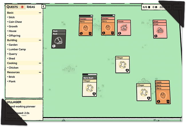
Stacklands has a simple card layout (partly because it displays advanced info in hover tooltips), but even a more complex game such as Marvel Champions (which I wrote about here) can convey as much as 16 pieces of information on a single card. Thanks to the consistent hierarchy & visual language, you don’t feel overwhelmed when playing, you just know how to retrieve the necessary information and can safely ignore the rest.
Moreover, cards are also simple objects to understand & manipulate. They are too thin to stand on their own, which means their “natural” states are held in your hand or laid down on the table (on either side). Cards can easily be put on top of one another to create a deck, which is convenient to shuffle them.
A game can have you arrange cards in different groups to give them a new meaning, again thanks to their uniform size & shape. This is another key UX concept: the law of Proximity.
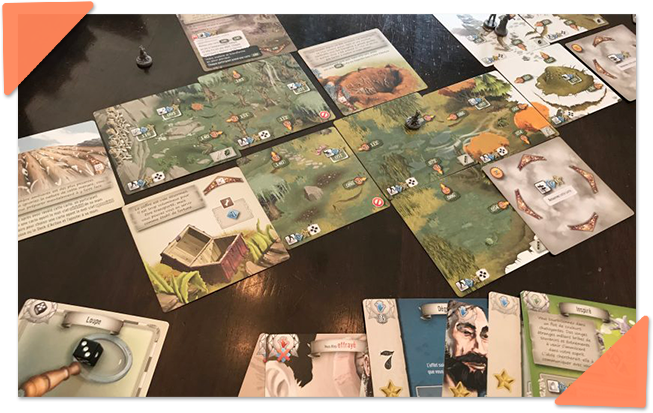
The cards in front of each player may represent their personal constructions (7 Wonders) and cards next to one another can create a map to explore (The 7th Continent). There can be many sorts at once out on the table, yet with good organization that gives them different meaning, it won’t overload the players.
All You Can Stack (& More)
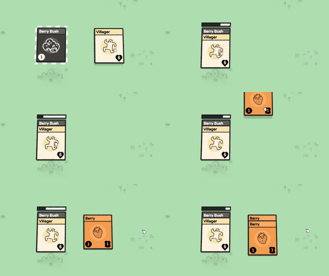
Stacklands, as its name subtly suggests, is all about stacking cards: drag any card above another to make a pile & discover how they interact. If a progress bar appears above the stack, something is bound to happen, usually the spawn of a new card. For instance, you may put your Villager on a Berry Bush to “harvest it” (= generate Berry cards) and once depleted, the bush card will disappear. That’s how simple it is.
When the game starts, you have a few elements, all of which are recognisable so you can quickly discover combinations. Unlike games with tricky crafting UIs (such as Minecraft), if you have an assumption, there is only one way to validate it in the game: by stacking cards. Could I cook a berry on a campfire? Apparently no.
As the game progresses, you’ll have to rely on the helpful encyclopedia on the left of the screen to support your memory. Cards may have intuitive UX, but humans still need time to remember many pieces of information, usually through repeated exposure.
It’s incredible how many different “action verbs” this single “drag & drop” mechanic can support: craft, harvest, combat, trade, grow, cook. All are unified under a single system you have to learn once.
But wait, isn’t that a crime against variety? Are players ok with such a uniform experience?
In games whose appeal is to explore & master the systems -like survival games- players won’t care about having fewer mechanics or barebones realisation (as you may have noticed, Stacklands strength isn’t character animation or world immersion). The variety of the game comes from the depth of content and the unique effects they may provide.
Actually, Stacklands wouldn’t work better if it were a fully realised 3D game, cards are more efficient at delivering this type of experience.
Accepting Arbitrary Rules
As I said, Stacklands is more than a cool simulation where you toy with elements to identify combinations: it’s a survival game and at the end of each day, you must feed your people, or they’ll die (which makes it particularly difficult to continue the run).
What matters to me here is how the cards-only realization of Stacklands helps the designers to explain the game loops & make the player accept restrictive mechanics.
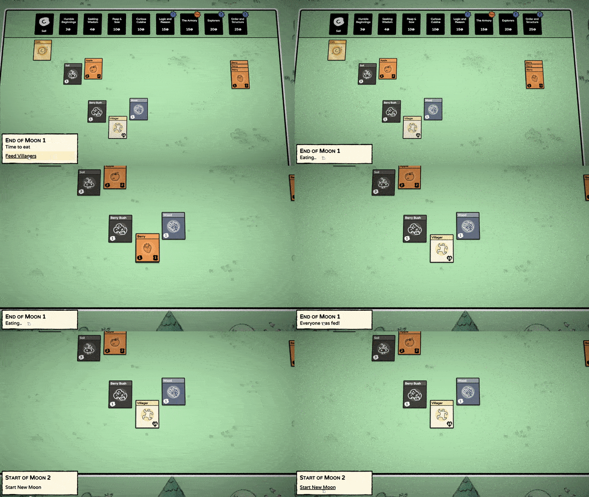
At the end of each day, the feeding is automatic, and it takes one second to show it simply by moving food cards, destroying them with a crunchy sound & panning the camera. It sounds obvious (again), but when everything is a card of the same size, even a basic animation like this is perfectly readable, and of course, it’s a lot easier to make for the developer.
There’s another area where cards have a significant advantage: inventory restriction. Traditionally, making players accept any sort of limitation is tricky, and it gets even more so (by several orders of magnitude) when the rule doesn’t seem fair.
In Stacklands, the card limit at the end of each day forces you to sell cards before moving on! It sounds like a design nightmare, but not here: the “physicality” of cards makes the rule limpid. You either have more cards than allowed or not. Imagine transposing this to a 3D environment, the same limit would feel arbitrary (how does a tree count in my inventory limit? and why is an egg counting for as much as a house?)
Randomness is another difficult mechanic to accept in general, but lucky for us, there are models you can use: the booster pack. Not only does this make the experience cohesive, but it also serves ideally the developers’ need for variance.
Conclusion
I like to end these articles with the universal lessons that apply beyond the studied genre.
The main inspiration we can draw from Stacklands, in my opinion would be how its developers leveraged recognisable concepts (the playing cards) to lay the foundations of an intuitive UX, yet still used the digital capacities of the medium to the maximum to introduce fresh rules that no one could have done before in physical board games.
When inventing new experiences, we always base ourselves on many existing concepts. The designer's strength is recognizing where we should stay faithful & where we should twist to create new experiences.
If you liked the topic of this article, I’m sure you’d also enjoy this one:


